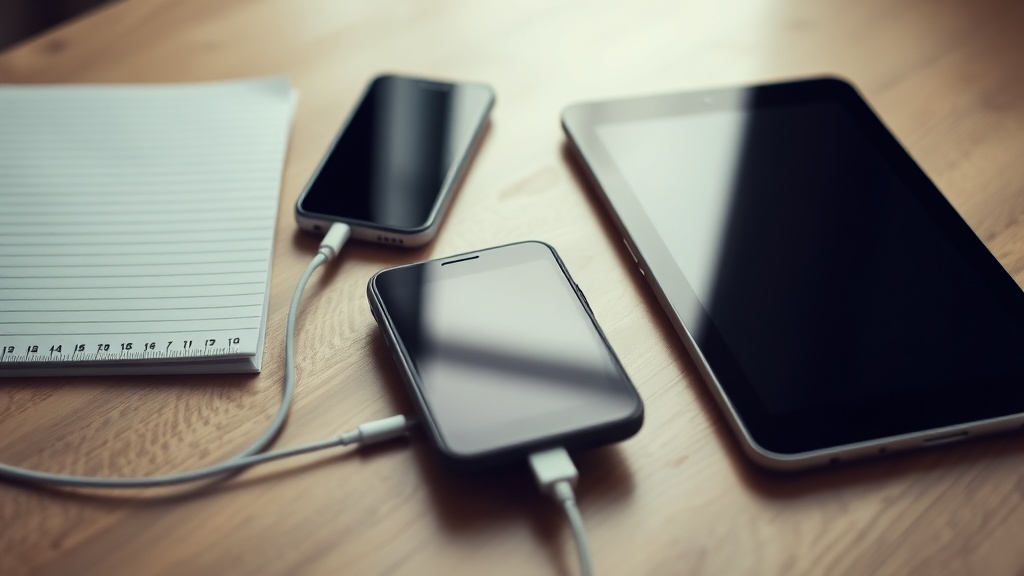
Your product photography does not need a studio to look deliberate
Build a repeatable setup with natural light, simple surfaces and a small set of props.

You have a useful product ready to sell, but the images still look like an afterthought: a workbook photographed on a crowded desk, a coaching offer represented by a generic laptop mock-up, or a course cover lit by the blue glow of your monitor. You do not need a studio to fix that. You need a small setup you can repeat whenever you make something new.
Start with one dependable corner
Choose a place near a large window, then take a few test photos at different times of day. You are looking for light that is bright enough to show texture but not so direct that it creates hard, distracting shadows. A north-facing window can be useful for softer light, but any window can work if you move the product back from the glass or hang a thin white curtain.
Turn off overhead lights while you shoot. Mixed light sources can make one part of the image look warm and another look blue. Put your phone or camera on a stack of books, a small tripod or any stable support. Stability matters more than having the newest camera because it lets you keep the framing consistent between products.
- Place the product at a right angle to the window for visible shape and gentle side shadows.
- Use a sheet of white card opposite the window to bounce light back into darker areas.
- Move the product rather than zooming whenever possible; your phone will usually retain more detail.
- Clean the lens before shooting. A small smear can make a sharp image look dull.
Build a surface you can reset
The background does not need to be expensive. A sheet of matte card, a piece of painted board, plain fabric or a cleared wooden table can give you a dependable base. Choose a surface that supports the product rather than competing with it. A busy pattern may look interesting in one photograph, but it becomes difficult to repeat across a whole catalogue.
Keep the camera position and surface relationship fixed. You can mark the feet of your tripod with small pieces of removable tape and note which side of the window you use. If your product is a PDF, template or course, the physical scene may be a printed cover, a tablet showing one page, a notebook or a hand taking notes. The setting should help someone picture using the product, not suggest that a physical object will arrive in the post.
Use props to explain, not decorate
Choose two or three props that make the product's use easier to understand. A pen beside a worksheet suggests writing. A cup beside a planning template suggests a morning routine. A pair of headphones near a lesson cover suggests listening. These objects add context when they answer a question about use.
| Product | Useful context | Prop to avoid |
|---|---|---|
| Printable planner | A partially completed page and a pen | Several unrelated stationery items |
| Video course | A laptop or tablet with a clear lesson screen | A screen filled with unreadable placeholder text |
| Coaching call | A notebook, headphones or a prepared question | A staged desk covered in decorative objects |
| Membership or community | A calendar, discussion prompt or work-in-progress | A generic image that does not show the member experience |
Make a small shot list
Do not rely on improvisation every time. Before you put the product down, write the handful of views you need. This also prevents you from spending an hour making nearly identical images while missing the one view that explains the offer.
- 1The clear hero image: the product alone, framed simply enough to recognise at a small size.
- 2The in-use image: a hand, device or workspace showing how the buyer might use it.
- 3The detail image: a page, screen, section or feature that demonstrates the level of care inside.
- 4The scale image: something familiar that shows the size of a printed item or the shape of a physical bonus.
- 5The collection image: related products together, if buyers can purchase them separately or as a bundle.
For a digital product, screenshots often carry more meaning than a decorative scene. Crop them so the important part remains legible on a phone. You can place a screenshot inside a device frame, but keep at least one image that shows the actual interface, page or lesson. That distinction helps buyers understand what they receive after payment.
Edit for consistency
Editing should correct the photograph, not turn it into a different scene. Crop each image to a similar shape, straighten visible edges and adjust exposure so the product is easy to see. If one image has a warm yellow cast and the next is cool blue, the catalogue will feel disconnected even if each photograph is attractive on its own.
Create a basic naming system as well. For example, use the product name followed by the view: planner-hero, planner-use and planner-detail. Keep the original files in one folder and the web-ready versions in another. This makes a later refresh quicker and gives you a record of which image belongs to which offer.
Carry the system into your storefront
Your photographs do their best work when the rest of the buying path is clear. Use the same crop style, background family and prop logic across your product covers. Then make sure the product page explains the format, what is included and what happens after purchase. If you sell a PDF, for example, an image can show a page, while the description states that the buyer receives a digital download.
On store.fan, you can present digital products through a storefront at store.fan/yourusername and connect the image to the offer it represents. For [digital downloads](/features/digital-downloads), the photograph or cover should support the delivery information rather than carry it alone. Store.fan takes 0% of sales, while Stripe's own processing fee still applies and the money goes straight to your Stripe account.
If you sell several formats, give each one a visual cue that remains consistent: perhaps the same surface for workbooks, a repeated device angle for courses and a quieter portrait-oriented frame for coaching. The [store designer](/features/store-designer) can then help you arrange those offers without asking every product image to do the same job.
Yes. Use the rear camera, clean the lens, stabilise the phone and avoid digital zoom. Good window light and a clear composition will usually make a bigger difference than a more expensive device.
Start with three: a clear hero image, an in-use image and a detail or contents image. Add more only when they answer a real question about the product, format or buying decision.
Shoot near the brightest window you have, use white card to lift shadows and choose a time when the light is steady. If the result still does not show the product accurately, a basic continuous light or professional shoot may be worth the cost.
Set up a storefront for the products your new photography helps people understand.
Start sellingTurn your knowledge into income
Launch your Store.Fan in minutes — sell digital products, courses, and calls straight from your bio. Free to start.