
Give your storefront a visual signature before choosing a theme
Build a recognisable look from colour, type and composition before customising templates.
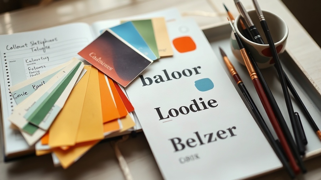
You have opened your storefront preview for the sixth time. The products are ready, the descriptions are nearly there, but the page still feels like a collection of separate decisions: one colour from an old logo, a typeface chosen because it looked interesting, and a row of product images with no obvious relationship. Before you choose a theme, give the storefront a visual signature. That means deciding how colour, type and composition should behave together, then choosing a template that makes those decisions easy to see.
Start with three decisions
You do not need to settle every visual detail before publishing. Start with three decisions that can be applied across your home page, product covers, sales images and emails: a colour relationship, a type relationship and a composition rule. These are easier to repeat than a long list of brand guidelines, and repetition is what makes a small catalogue feel connected.
| Element | Decision to make | What repetition looks like |
|---|---|---|
| Colour | Choose one main colour, one supporting colour and a neutral | Buttons, labels and backgrounds use the same roles from page to page |
| Type | Give each typeface a job | Headings, body copy and small labels remain easy to identify |
| Composition | Choose how images, text and empty space are arranged | Product covers and sections share a recognisable rhythm |
The exact colours matter less than the roles. A dark colour might carry headings and navigation, while a brighter colour marks actions. A neutral background can give the product images room. If every colour is used everywhere, none of them helps the visitor understand the page. If you want to make these choices directly on your storefront, store.fan's store designer gives you the place to apply them rather than leaving the decisions scattered across separate tools.
Make colour carry information
Treat colour as a signpost before treating it as decoration. Decide what the visitor should notice first, then assign colour to that job. For example, you might reserve your strongest colour for purchase buttons and important links, use a quieter tone for supporting panels, and keep most text in a neutral. This creates a visual hierarchy that works even when someone is scanning rather than reading.
- 1Choose a background that keeps product images and text legible.
- 2Choose a text colour that remains comfortable across long descriptions and mobile screens.
- 3Choose one action colour and use it consistently for the things you want people to click.
- 4Check your products together, not one at a time, and remove any colour that appears only once without a clear reason.
A useful test is to look at the page in greyscale, or simply squint at it. If the button, heading and product image all compete for attention, colour is not doing enough organisational work. If the page becomes impossible to navigate without its colours, the contrast or labels may be doing too little. Your visual signature should make the structure clearer, not make visitors decode it.
Give every typeface a job
A typeface can suggest a mood, but its first responsibility is to help someone understand what they are seeing. Assign jobs before choosing personalities. One style can handle headings, another can handle body copy, and a smaller treatment can handle labels or metadata. You may use one family for everything, provided the differences in size, weight and spacing are clear.
Avoid choosing several expressive fonts simply because each one looks good in isolation. On a storefront, the visitor is moving between product names, prices, descriptions and calls to action. Too many competing voices make those transitions harder to follow. Test your type choices with real words: a long product title, a two-line description, a price and a button. Your fonts need jobs, not just personality, especially when your products need to be understood quickly.
Build a composition people can recognise
Composition is the pattern of where things sit. It includes the amount of empty space around a product, the position of a title on a cover, the shape of your images and the order of sections on the page. You do not need every product image to be identical. You do need enough shared structure that a visitor can tell they belong to the same maker.
Choose one or two rules that fit the way you sell. You might place product titles below images with generous space around them. You might use close-up, practical images rather than floating mock-ups. You might put a short promise at the top of each product page, followed by what is included and who it is for. When these rules repeat, your storefront becomes easier to scan and your product range feels deliberate.
Choose the theme after the system
Now compare themes against your decisions rather than asking which one looks nicest in a blank preview. Does it give your main colour a clear role? Can your product titles remain readable at their longest? Does its spacing support the amount of information buyers need? Will the layout still work if you add a course, a download, a coaching call or a membership later?
A theme is a set of layout constraints. That is useful because constraints stop every page becoming a new design project. It is limiting when the theme's assumptions conflict with how people buy from you. A storefront for a small library of downloads may need quick comparison. A coaching storefront may need more explanation and a clearer route to booking. Choose a storefront theme around how people buy from you, then use the visual signature to make that structure feel like yours.
On store.fan, you can use the free plan as a link-in-bio storefront, while paid plans start with a 14-day trial. The platform takes 0% of sales, although Stripe's own processing fee still applies, and money goes straight to your own Stripe account. Those details matter because the visual work should support a selling setup you can actually keep using, not become another unfinished branding exercise.
Start with a main colour, a supporting colour and a neutral. Add another colour only when it has a specific job, such as indicating a category or a special campaign. Fewer roles make mistakes easier to spot and changes easier to manage.
No. A consistent product image treatment, type hierarchy and action colour can create recognition before you have a finished logo. Make the buying path clear first, then add identity elements that reinforce it.
Keep the structural choices consistent, such as spacing, heading treatment and button style, while allowing the product imagery or supporting colour to change. If the audiences need completely different buying journeys, separate landing pages or storefront sections may be more useful than forcing one visual style across everything.
Set your visual rules, then build a storefront that gives them room to work.
Start buildingTurn your knowledge into income
Launch your Store.Fan in minutes — sell digital products, courses, and calls straight from your bio. Free to start.


