
Your product covers should look related without becoming identical
Create a flexible cover system that makes your catalogue feel coherent and easy to browse.
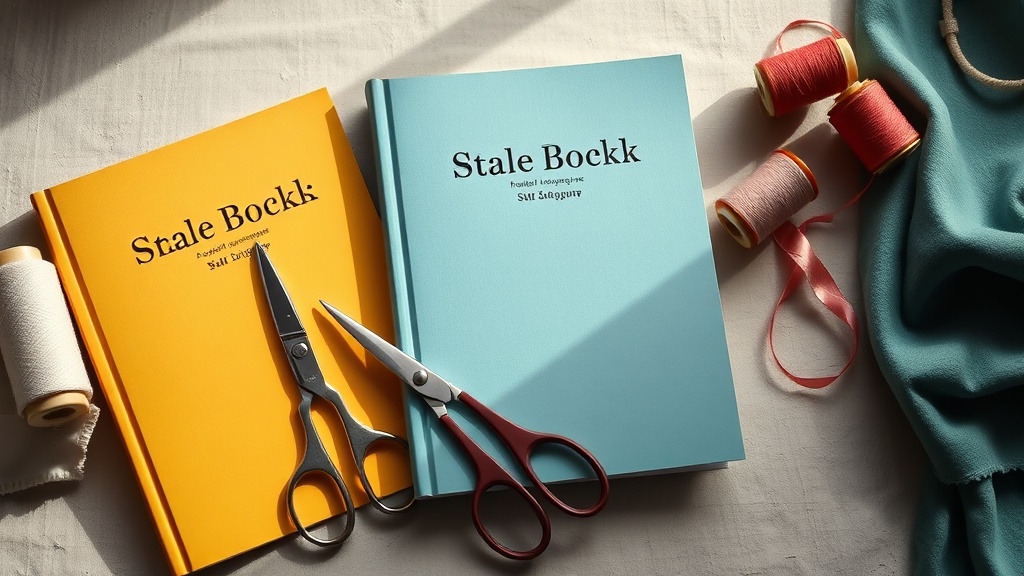
You add a new workbook to your shop, then notice that its cover looks as though it belongs to a different business. The colours have changed, the title sits in a new place and the image style no longer matches the rest. Nothing is technically wrong, but browsing your catalogue feels harder than it should. A cover system solves this without forcing every product into the same template.
Start with the job of the cover
A cover has at least two jobs. It should identify the product, and it should help someone compare that product with the others around it. The second job is easy to miss when you design one cover at a time. You may be trying to make each product look impressive on its own, while your customer is trying to answer a simpler question: which one is for me?
Before choosing colours or mock-ups, write down the information a buyer needs at a glance. For a template, that might be the format and outcome. For a course, it might be the subject and level. For a coaching call, it might be the specific problem discussed. Put that information in the title or subtitle rather than expecting the image to explain everything.
- 1List the product types in your catalogue, such as downloads, courses, calls or memberships.
- 2Choose the one detail that distinguishes each product from its neighbours.
- 3Decide what must remain readable when the cover is reduced to a small card.
- 4Remove decorative elements that do not help identification, comparison or trust.
Choose the parts that stay consistent
A flexible system is not a single file duplicated many times. It is a short list of rules. The rules create familiarity; the variation gives each product a reason to exist. You might keep the title position, typeface and corner treatment fixed, while changing the background colour and supporting image.
| Keep consistent | Allow to change |
|---|---|
| Title position and alignment | Background colour within your palette |
| Typeface and basic text hierarchy | Product-specific subtitle |
| Logo or creator mark placement | Image, illustration or object |
| Border, corner or label treatment | Collection or difficulty marker |
| Approximate contrast and spacing | Small visual detail linked to the topic |
Limit the system to decisions you can repeat. If every cover needs a different collage, custom illustration and new font pairing, the system will become another form of production work. A useful test is whether you could brief someone else to make the next cover using one page of instructions.
Build variation in layers
Think of each cover as three layers. The first is the shared frame: the grid, typeface, margins and logo position. The second is the category signal: perhaps one colour family for courses, another for downloads and a third for coaching. The third is the product signal: the title, image or small symbol that makes this item distinct.
This gives you a practical way to stop covers becoming identical. Keep the first layer almost unchanged. Vary the second layer by product family. Use the third layer to describe the individual offer. If two covers still look interchangeable, the problem is usually in the product signal, not the need for more decoration.
Colour works best when it has a job. Assign one colour to the background, one to text, one to emphasis and a few optional category colours. Check that the text still passes a basic squint test: if you blur your eyes or look from a distance, the title should remain the strongest readable shape. A large title in a quiet layout is often more useful than a complicated image.
Check the cover where people will see it
Your working file is probably large, close up and surrounded by empty space. Your customer may see the finished cover as a small card in a storefront, a thumbnail in a link-in-bio page or a preview on a phone. Test the design in those conditions, not just on your canvas.
Put three to six covers next to one another and reduce them to roughly the size of the cards in your catalogue. Look for three things: can you tell the products apart, can you identify the product family and can you read the main title? If one cover attracts attention only because it is louder, ask whether it is actually the most relevant product or merely the most contrasting one.
Your storefront is part of this test. On store.fan, you can shape the presentation of your shop around the way products are browsed, then review the covers together rather than approving them in isolation. The design is doing its job when the catalogue feels ordered before anyone reads every description.
Turn the system into a small production process
Save a master file with locked elements for the frame, type styles and logo. Create named colour swatches and write the rules beside the artboard. Then make a checklist for each new cover: product name checked, subtitle shortened, image licensed, contrast reviewed, mobile thumbnail tested and export named consistently.
Use the same approach for different product formats. A downloadable guide can have a document or page motif; a course can use a lesson or screen motif; a coaching call can use a question or conversation motif. The objects change, but the visual grammar does not. If you sell files, you can also keep delivery and presentation together through store.fan digital downloads rather than sending buyers to a separate product page.
Review the system after five or ten covers, not after every single one. You are looking for repeated friction: titles that are always too long, category colours that do not have enough contrast, or images that become meaningless at thumbnail size. Fix the rule once, then apply the fix to the whole catalogue.
Make the catalogue feel like one place
Coherence comes from repeated choices, not from making every product visually quiet. Let one cover be more colourful or more photographic if the system gives it a clear relationship to the others. The customer should be able to recognise your shop as a whole and still understand why each product deserves its own click.
This is also why your storefront matters more than a folder of finished graphics. On store.fan, the cover, product description and checkout sit in one buying path, with money going straight to your own Stripe account and 0% taken by store.fan from sales. Stripe's own processing fee still applies. If you are ready to sell rather than only link out, paid plans begin with a 14-day trial; the free plan is link-in-bio only.
Start with one shared frame and, if your products genuinely need it, one variation for a different format. Add another only when the existing structure makes a product type harder to understand. More templates create more decisions to maintain.
No. Keep the colour roles and contrast rules consistent, then use a limited palette to signal categories or collections. Too many unrelated colours make the catalogue feel assembled rather than designed.
Keep the cover focused on the clearest product identifier and move supporting detail into the subtitle or product description. Do not shrink the type until every word fits. A shorter, specific title is usually easier to scan.
Build a storefront where related covers are easy to browse and distinct products are easy to choose.
Start your shopTurn your knowledge into income
Launch your Store.Fan in minutes — sell digital products, courses, and calls straight from your bio. Free to start.


