The Webinar Slide Deck Playbook: Designing a Presentation That Sells Without Feeling Salesy
Your slides are doing half the selling — here's how to design a deck that teaches, builds trust, and closes.
Most webinar advice is about the funnel — the registration page, the reminder emails, the follow-up sequence. Almost none of it is about the actual sixty minutes people spend staring at your screen. That's a mistake, because your slides aren't a visual aid propping up your talking — they're a second, silent presenter running the whole time, and a cluttered, text-heavy deck can undercut a great pitch just as easily as a great deck can rescue a mediocre one. This is a pure design playbook: how to build a slide deck that teaches clearly, earns trust visually, and makes the close feel like the obvious next slide instead of a jarring sales pitch bolted onto the end.
Why the deck matters more than most creators think
A webinar audience is judging you constantly, and most of that judgment happens visually, not verbally. A deck stuffed with dense paragraphs, mismatched fonts, and stock clip art quietly tells the room "this was thrown together five minutes ago" — and if the prep looks rushed, people assume the product behind it is too. Conversely, a clean, consistent deck with confident white space does something subtle but powerful: it signals that you take your own material seriously enough to polish it, which is exactly the trust transfer you need right before you ask for a sale. Design isn't decoration here. It's an argument for why someone should believe you know what you're doing.
The three-zone structure: teach, bridge, pitch
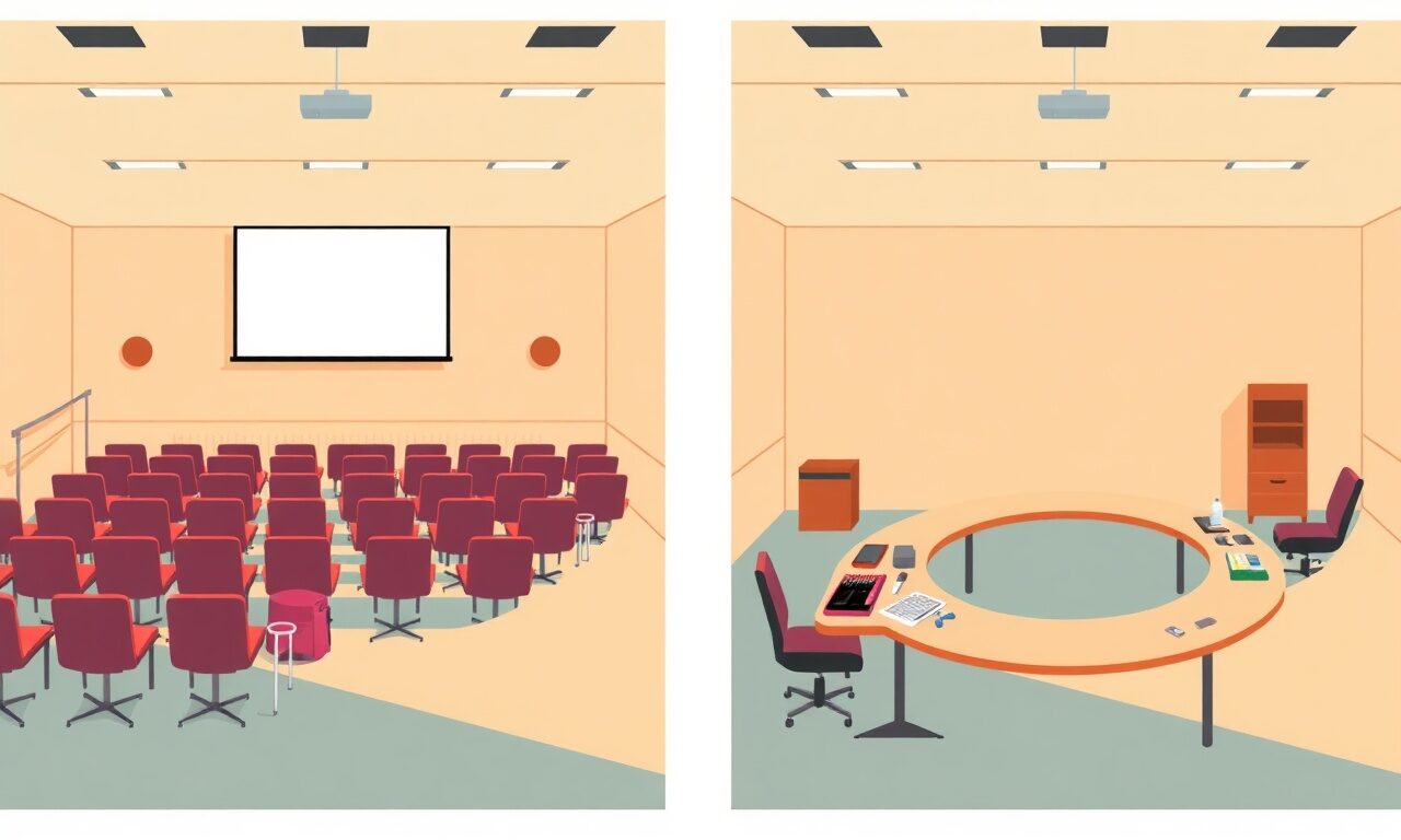
The single biggest design failure in webinar decks is visual sameness — every slide, from the opening hook to the final price slide, uses the same template, same colors, same layout. That flatness works against you, because it means the room never feels the shift from "free lesson" to "here's the offer." Deliberately design three visually distinct zones so the transitions register on a gut level before you even say a word.
| Zone | Visual treatment | What it should feel like |
|---|---|---|
| Teaching | Clean, calm, generous white space, one idea per slide | A genuinely useful lesson, not a preview of a pitch |
| Bridge | Slightly bolder color, a single contrast slide or two | A visible turn — "here's the gap the lesson can't close" |
| Pitch | Its own template: offer name, price, what's included, checkout link | A clear, confident presentation of a real product |
You don't need three separate design systems — a shift in accent color, a heavier headline weight, or a different slide border is enough to make the room feel the change. What matters is that it's deliberate, not accidental. If your bridge and pitch slides look identical to your teaching slides, the pitch arrives with no visual warning, and warning is exactly what makes a pitch feel earned rather than sprung on people.
Slide-by-slide rules that actually hold up
One idea, one slide
If a slide has a headline, three bullet points, a chart, and a quote, you've built four slides and crammed them into one. Every time you're tempted to add "just one more point," that's the moment to add a new slide instead. A deck with more slides that each say less will always out-teach a deck with fewer slides trying to say everything at once — and it reads as more organized, not less.
Words are a label, not a script
The text on a slide should be short enough that someone glancing at it for two seconds gets the gist, while you supply the depth out loud. Full sentences on slides compete with your voice — the room either reads ahead of you or tunes you out to finish reading. Cap headlines around six words and any supporting text at a single short line. If you need the audience's eyes on you rather than the screen for a stretch, that's a good sign the slide should be nearly blank.
Consistency beats cleverness
Pick two fonts, one accent color, and one layout grid, then use them for the entire deck outside your three deliberate zone shifts. A deck that changes fonts or colors slide to slide, chasing "variety," reads as unpolished no matter how good any individual slide looks. Boring consistency is a feature here, not a compromise — it's what lets your content, not your formatting, hold the room's attention.
Pre-webinar deck audit
0/6Designing the pitch slides so they don't feel like a pitch
The reason pitch slides so often feel like an ambush isn't the content — it's that they suddenly look like a different presentation, thrown together fast after thirty-five minutes of polished teaching. Give the pitch section the same design care as the rest of the deck: a clean offer-name slide, a single slide breaking down what's included (three to five items, not a wall of bullets), one slide with the price stated plainly, and one closing slide that is nothing but the product name, the price, and the link. Resist the urge to cram everything — name, price, bonuses, guarantee, and link — onto a single busy slide. Spread it across four or five clean ones and the pitch reads as considered rather than rushed.
A pitch slide that looks as polished as your teaching slides doesn't feel like a pitch — it feels like the next logical lesson.— store.fan team
The close slide: the one that has to work
Everything in the deck exists to walk the room toward one slide: the close. Design it last, and design it obsessively simple — product name, price, one line of what's included, and a large, visible checkout link or QR code. Leave this slide on screen through your entire live Q&A instead of switching back to a thank-you graphic; the seconds right after the pitch, while people are deciding, are exactly when you want the path to purchase sitting in front of them. A confusing or cluttered close slide is where otherwise well-run webinars quietly lose sales nobody notices leaving.
- State the price as a number on the slide — don't make people do math or wait for you to say it
- Use a single, large, high-contrast button graphic or link, not text buried in a paragraph
- If you're offering a live-only discount code, put it on this slide too, large and legible
- Keep this exact slide up during every question in your live Q&A segment
- Screen-share the actual checkout page once so nobody is unsure what happens when they click
Where the slide ends and the store begins
A beautifully designed close slide still needs somewhere real to send people, and that's where a lot of otherwise strong decks fall apart — the link goes to a generic payment form, a DM request, or a page that doesn't match the polish of everything that came before it. That's the gap a proper storefront closes: create your store once, list the webinar offer with a real price and description, and the checkout link you put on that final slide leads to a page that looks as considered as your slides do. Buyers pay with a card, Apple Pay, or Google Pay, and get instant, automatic delivery — the replay, course access, or coaching link lands in their inbox before your Q&A even wraps. A live example store shows what that finished page looks like in practice, and it's worth matching your deck's colors to it so the whole experience feels like one product, not three disconnected tools.
Give your slides a real checkout to point to before your next live session.
Start freeCommon design mistakes that quietly cap conversion
Most decks that underperform aren't failing on the offer or the teaching — they're losing trust and clarity through fixable design habits.
- Dense paragraph slides: if the audience is reading instead of listening, your voice becomes background noise.
- Stock photos that don't match your brand: generic imagery reads as filler and dilutes credibility you've otherwise earned.
- No visual shift into the pitch: without a design cue, the sales section feels sudden and defensive.
- Tiny or buried pricing: making people hunt for the number invites hesitation right when you need clarity.
- A close slide that disappears during Q&A: switching back to a logo slide removes the path to purchase exactly when people are deciding.
Somewhere around 30-45 works well for most formats — roughly one slide per minute during teaching, with a few extra, near-blank slides where you want full attention on you instead of the screen.
No — the templates in Google Slides, Keynote, or Canva are enough once you enforce the consistency rules above. The discipline matters more than the tool.
Put it on the slide. Ambiguity about price stalls decisions, and people who tune out for a moment shouldn't miss the number entirely.
Usually yes, and it's faster than it sounds: split overloaded slides in two, cut text down to labels, and unify fonts and colors. Most decks improve dramatically in an afternoon.
Check the FAQ for setup basics and pricing for plan details, or contact support if you get stuck listing your webinar as a product.
The short version
Design your deck in three visually distinct zones — teaching, bridge, pitch — so the room feels the shift instead of getting ambushed by it. Keep every slide down to one idea, cap the words, and let the close slide be the simplest, most obsessively clear screen in the whole deck. Then make sure that slide actually leads somewhere worthy of the polish: a real checkout page, not a promise to follow up later. Do that once and you'll reuse the deck, and the store page behind it, for every webinar after this one. Browse the blog for more guides on the rest of the webinar funnel, and get your offer live on store.fan before you build your next slide.
Turn your knowledge into income
Launch your Store.Fan in minutes — sell digital products, courses, and calls straight from your bio. Free to start.