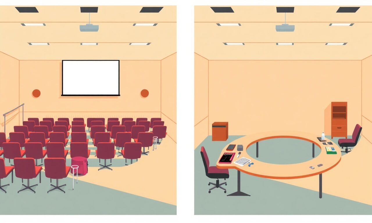
The First Screen a New Student Sees: Designing a Course Landing Moment That Doesn't Lose Them
The gap between 'I just paid' and 'I found lesson one' is exactly where excited new students quietly vanish.
A student just paid you real money at 11:47pm on their phone, riding a wave of motivation that peaked the second they hit the buy button. Then the screen changes. If what greets them is a wall of twenty-two unlabeled video files or a generic "Welcome to the course!" banner with no obvious next step, that motivation starts leaking out immediately — not over days, over seconds. The first screen inside your course isn't a formality between payment and learning. It is the product's first impression, and for a huge share of students it's the moment that decides whether they ever come back for lesson two.
Why this screen is a different problem than your welcome email
Most creators put real effort into the welcome email — the warm tone, the promise, the reminder of what's inside. That matters, but it's read (if read at all) in an inbox, minutes or hours after the purchase high has cooled. The first screen inside the course itself is seen during that high, while the student is still actively looking at their phone expecting to start. It's a UI and information-architecture problem, not a copywriting one. The question isn't "what should I say to welcome them," it's "what should their thumb do next." Conflating those two briefs is why so many course access areas feel like a filing cabinet instead of a front door.
The three failure modes that quietly kill momentum
Watch a first-time student open a course and you'll see the same three stumbles over and over. None are dramatic. All are fatal to momentum.
- The orientation gap: the student can see content exists but can't tell what to click first — everything looks equally important, so nothing feels urgent
- The scope shock: all forty lessons are visible at once with no grouping, and the sheer volume reads as "this is a huge project" instead of "this is a quick win away"
- The silent progress: nothing on screen acknowledges what the student has already done, so returning after day one feels like starting over rather than continuing
Designing the actual first screen
Think of the first screen in three stacked zones, in priority order: orientation, start-here, everything-else. Orientation is one or two lines confirming what they bought and roughly how long it takes — "6 modules · about 2.5 hours" reassures more than any amount of enthusiastic copy. Start-here is a single, unmistakably primary button labeled with the actual first action, not "Module 1" but "Start: Set up your workspace (4 min)." Everything else — full module list, bonuses, community links — lives below the fold or behind a collapsed "See full curriculum" toggle. You're not hiding content; you're sequencing attention.
This is the same layout thinking behind the content blocks in the store designer: a cover section, then one clear focal block, then supporting sections beneath. The instinct that keeps a storefront from overwhelming a first-time visitor keeps a course from overwhelming a first-time student. If you haven't looked at your own store.fan page with this lens lately, it's worth a second look — what's the one thing above the fold, and does it match what the buyer expects to do next.
Naming modules for outcomes, not topics
"Module 3: Advanced Techniques" tells a student nothing about why they'd click it. "Module 3: Write a headline that gets opened" tells them exactly what they get for their time. Outcome-based names do double duty: they reduce scope shock (each module reads as a discrete win, not a slice of a giant syllabus) and they turn the curriculum itself into marketing — a student scanning six outcome-named modules can feel the whole arc of the transformation before watching a single video.
| Topic-based naming | Outcome-based naming |
|---|---|
| Module 1: Introduction | Module 1: Get your first draft on the page in 20 minutes |
| Module 2: Tools Overview | Module 2: Set up the three tools you'll actually use |
| Module 3: Advanced Editing | Module 3: Cut a bloated draft down to something people finish |
| Module 4: Publishing | Module 4: Ship it and get your first ten readers |
Progress markers are motivation, not decoration
A simple checkmark next to a completed lesson, or a "2 of 9 lessons done" line at the top, changes the psychology of returning. Without it, every re-open feels like arriving at a party where you don't remember anyone — you have to reconstruct where you left off from memory. With it, the screen itself says "you're already partway there," a materially different feeling than "here's a pile of content you haven't touched." If your current course delivery shows no completion state, even a manual "mark as complete" toggle per lesson is worth adding first.
First-screen audit, run this on your own course today
0/6Where store.fan fits into this
When you sell a course through store.fan, access is delivered the same way a digital download is — instantly, on-screen right after checkout, and again by email, so there's no multi-day delay between payment and that critical first screen. That instant handoff is a feature worth protecting with good design, not undermining with a cluttered landing view. Structuring your course content with clear module order, short descriptive titles, and a logical first lesson does the heavy lifting; the platform's job is making sure that structure reaches the student the moment they pay. If you're still deciding how to package a course, a live example store shows what a clean, first-click-obvious layout looks like in practice.
This matters commercially, not just experientially. Completion rate produces testimonials, referrals, and repeat buyers of your next product. A student who finishes because starting was effortless tells a friend; one who bounces because they couldn't find lesson one quietly disappears, taking their word-of-mouth with them. If you haven't set up a course for sale yet, this is a good moment to create your store and build the access screen right from the first version.
Students don't quit courses because the content is bad. They quit because the first screen never told them where to start.— Common pattern across course-creator support threads
A simple two-week fix, no rebuild required
You don't need to rebuild your entire course to fix this. Spend week one auditing: run the checklist above, rename your modules for outcomes, and identify which single lesson should be the unmistakable "start here." Spend week two on polish: add a scope line at the top, add any completion markers your delivery method supports, and reorder so the shortest, most confidence-building lesson comes first even if it isn't first chronologically. Small, sequencing-only changes like these routinely move completion rates more than adding new content ever does — the bottleneck was never how much you taught, it was whether anyone got past minute one.
Yes, arguably more so — with only three or four lessons there's no excuse for a student not knowing which one comes first.
Yes, and it should point to the exact same lesson. Consistency removes any moment of doubt about where to click next.
Ask three recent buyers directly, or watch one screen-share a first login. If they hesitate looking for a starting point, that's your answer.
Course access is delivered through the same instant, automatic system as digital downloads, so the design work described here — module names, ordering, first-lesson choice — shapes the student's experience once they're in. Check the FAQ for specifics on delivery.
Before. A confusing first screen rarely generates complaints — lost students just go quiet instead of emailing you, and by the time you notice via low completion, you've lost their word-of-mouth.
Ready to sell a course your students actually finish, with instant, automatic access delivery built in?
Start freeThe takeaway
Every hour spent polishing a sales page and zero minutes spent on the screen right after purchase is a common, fixable imbalance. The first screen inside your course is where excitement either converts into action or quietly evaporates, and the fix is almost entirely about sequencing, not content volume: one obvious next click, outcome-named modules, a visible sense of scope, and some acknowledgment of progress. It requires looking at what you already built through the eyes of someone who just paid and has no idea yet where anything is. For more tactics on structuring what happens after the sale, browse more guides, and if you're comparing plans for course delivery, pricing lays out what's included on each tier.
Turn your knowledge into income
Launch your Store.Fan in minutes — sell digital products, courses, and calls straight from your bio. Free to start.