Course Completion by Design: Building Modules That Fight Off Refunds and Drop-Offs
Students who finish don't ask for refunds — here's how to design lessons, checkpoints, and nudges that keep them watching to the end.
Most creators treat refunds as a pricing problem or a marketing problem. Lower the price, tighten the sales page copy, add a testimonial wall. But if you pull the actual refund requests on any course and read them, a pattern jumps out: the people asking for their money back almost never finished module one. Refunds aren't a sales problem. They're a completion problem, and completion is something you can design for the same way you design a curriculum outline or a checkout page.
Why finishers don't ask for refunds
Think about the psychology for a second. A student who watched lesson 1 of 14 and stopped has almost no sunk cost in the material — bailing feels free. A student who's 60% through has invested hours, taken notes, maybe posted a win in a community. Asking for a refund at that point feels like throwing away their own progress, not just your product. That's the entire game: get people far enough in that quitting costs them something, not just you.
Most refund policies are built around a time window — 7 days, 14 days, 30 days. Very few creators build around a progress window instead, even though progress is the thing that actually predicts whether someone stays. If you only look at one lever this quarter, look at what happens in the first three lessons. That's where you win or lose the whole course.
Lesson pacing: the 7-12 minute rule
Long lessons feel generous when you're recording them and feel like homework when someone's trying to watch one on a lunch break. If your average lesson runs past 15-18 minutes, split it. A 45-minute deep dive on "email list building" should probably be three lessons: list magnets, opt-in placement, and welcome sequences — each one finishable in a single sitting with a clear, nameable outcome.
- Aim for 7-12 minutes per lesson for concept-and-demo content; shorter for pure mindset or motivation lessons.
- Open every lesson with the one sentence a student should be able to say when it's done ("I can now write a subject line that gets opened").
- End every lesson with a tiny, concrete action — not "reflect on this," but "write one subject line and save it."
- Batch related short lessons into named sub-sections so the course still feels substantial, not chopped up.
This isn't about making the course thinner — it's about making progress visible in smaller, more frequent wins. A 40-lesson course that feels like 40 tiny victories beats a 10-lesson course that feels like 10 assignments.
Progress checkpoints that create momentum
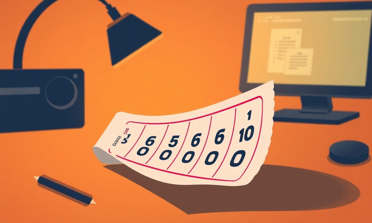
A flat list of video links gives a student nothing to hold onto. A percent-complete bar, a "3 of 5 modules done" counter, or a simple checklist a student can tick off as they go turns the same content into a game with visible stakes. This is one of the cheapest, highest-leverage changes you can make to an existing course, because it costs you zero new content — just structure.
Completion-by-design audit for an existing course
0/5A checklist a student can tick is worth more than a video a student can skip.
The mid-course nudge email
Here's the tactic most creators skip entirely: a single, scheduled email that goes out to anyone who bought the course but hasn't opened a lesson in 5-7 days. Not a sales email — a nudge. Short, warm, specific: "Hey, noticed you haven't gotten to Module 2 yet — here's the 90-second version of what it covers, and the direct link back in." This one email, sent at the right moment, will pull a real chunk of stalled students back in before they've mentally written the course off.
You can build this with store.fan's broadcast and campaign tools without any extra software: pull your customer list for that product, filter mentally (or by purchase date) for anyone in the stall window, and send a short, personal-feeling nudge. Pair it with a discount code reminder for a companion product if you have one, but keep the nudge itself about progress, not upsell — that's what makes it feel helpful instead of promotional.
| Symptom | Likely cause | Fix |
|---|---|---|
| Refunds cluster in week one | Lesson 1 is too long or too abstract | Shorten to under 12 minutes, end with a fast concrete win |
| Students stall after Module 1 | No visible progress marker | Add a percent-complete bar or checklist |
| Opens drop off mid-course | No re-engagement touchpoint | Send a mid-course nudge email at day 5-7 of inactivity |
| "Not what I expected" refund reason | Sales page oversells, curriculum undersells | Match sales page bullets to actual module names |
| High completion but low reviews | No closing ask | Add a final lesson that explicitly asks for a testimonial |
Where this connects to your storefront
None of this works if the buying and delivery experience is clunky, because a confused student stalls before lesson one even loads. When someone buys through your storefront, they should land on their content instantly — no separate login to remember, no "check your email in 24 hours." That instant, automatic delivery is the foundation completion-by-design sits on top of; if you haven't yet, it's worth reviewing how your course is packaged and delivered before you touch pacing or checkpoints at all. If you want to see the whole flow end to end, a live example store shows how a course product looks from cover to checkout.
It's also worth checking your numbers against a real distribution instead of guessing. Pull your last 90 days of course customers, note where each refund request happened in the curriculum, and you'll usually find 70-80% of them stalled in the same one or two lessons. Fix those specific lessons first — don't rebuild the whole course on a hunch.
FAQ
No — it usually makes it look more professional. Bloated 40-minute lessons read as unedited, not premium. Tight, outcome-driven lessons read as intentional design, and they're what actually gets finished.
A simple checklist page or a module-by-module progress note goes a long way. Combine it with your customer list and broadcast tools so you know who's active and who's gone quiet — you don't need dedicated LMS software to run completion-by-design well.
Keep the nudge itself about progress and value, not a discount — that's what makes it land as helpful rather than salesy. Save discount codes for separate win-back campaigns after a refund window has passed.
Yes, even more so. A 5-lesson course has almost no room for a bad lesson 1; the stakes on pacing and the opening win are higher, not lower, when there are fewer lessons to recover in.
Check the FAQ for common questions on refunds and delivery, and browse pricing to see which plan fits how many products you're running. If you get stuck setting up campaigns or checklists, contact support — real humans, not just a help center.
Refund prevention isn't a policy you write once and forget — it's a design decision you make in every lesson, every module boundary, and every quiet week when a student's momentum starts to slip. Get the pacing, the checkpoints, and the nudge right, and you'll spend less time writing refund emails and more time reading five-star reviews. For more tactics like this, keep browsing the blog — and if you're still selling your course through a patchwork of tools, it's worth seeing what a single storefront on store.fan looks like end to end.
Ready to package your course with instant delivery, checklists, and nudge-ready email tools built in?
Start freeTurn your knowledge into income
Launch your Store.Fan in minutes — sell digital products, courses, and calls straight from your bio. Free to start.