PDF or Print-at-Home? Choosing the Right Format for Your Planner, Guide, or Worksheet
The same content can flop as a screen-only file or thrive as a printable — here's how to pick before you design page one.
A meal-prep planner creator we know spent three weeks building a gorgeous 40-page interactive PDF — tappable tabs, embedded checkboxes, a table of contents that jumped between sections. Refund requests started on day two. Her buyers weren't tapping anything; they were printing it on a home inkjet, and the dark navy backgrounds she'd designed for screen viewing were eating an entire ink cartridge per copy. Meanwhile, a habit-tracker creator in the same niche shipped a plain, high-contrast, print-ready worksheet with generous margins and zero background color — and it became her best-selling product, precisely because her buyers were the type who clip it to a fridge with a magnet. Same category, same effort, opposite outcomes. The difference wasn't quality. It was format-market fit, decided before either of them opened a design file.
Start with the buyer's habit, not the product idea
Every planner, guide, or worksheet gets used in one of two physical contexts: on a glowing screen, or on a physical surface with a pen in someone's hand. Before you open a design tool, picture your actual buyer at 7am on a Tuesday. Is she scrolling her phone during a commute, or standing at a kitchen counter with a coffee and a highlighter? A budgeting spreadsheet template lives on a screen because it needs formulas and live calculation — nobody wants to redo math by hand. A weekly meal-prep chart lives on a fridge because it needs to survive flour-dusted hands and a glance from across the room. A 12-week fitness program guide is genuinely hybrid: read the explanations on a phone, but print the weekly log sheet to check off at the gym. Get this classification wrong and you're not just picking the wrong export setting — you're building the wrong product for how people actually behave.
The three formats, and when each one wins
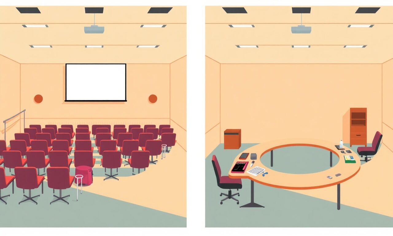
Think of format as a spectrum, not a binary choice. On one end is a pure on-screen PDF: fillable form fields, hyperlinked navigation, embedded images, dark or colorful backgrounds, designed to never leave a device. On the other end is a pure print-ready printable: high-contrast black text on white, no background fills, generous bleed-free margins, letter or A4 sized, designed to come out of a home printer looking crisp on the first try. In the middle sits the hybrid release — one file (or two versions of the same file) that covers both use cases. Here's how to read the signals.
| Signal | Points to on-screen PDF | Points to print-at-home |
|---|---|---|
| Where buyers say they'll use it | Phone, tablet, laptop during commute or downtime | Desk, fridge, planner binder, wall |
| Interaction type | Tapping, typing, clicking links, saving progress | Writing by hand, checking boxes with a pen |
| Content shelf life | Referenced repeatedly, needs search or bookmarks | Used once per day/week then replaced or archived |
| Visual style that sells it | Bold colors, photos, dark backgrounds, motion-like layout | Clean lines, generous white space, minimal ink use |
| Buyer's stated pain point | "I keep losing track of tabs and files" | "I don't want another app, I want paper" |
Design decisions that change depending on your answer
Once you know which end of the spectrum you're building for, a dozen small decisions get easier. For screen-first products: design at a comfortable reading size for a phone (portrait orientation performs better than landscape for mobile PDF readers), use tappable internal links for navigation instead of relying on scrolling, and don't worry about ink cost — dark backgrounds and full-bleed color photography are assets, not liabilities. For print-first products: flip all of that. Default to white or very light backgrounds, keep text dark and high-contrast, avoid full-page color fills that will turn a $0.03 page into a $0.30 page on a home printer, add a thin border so guillotine-trimmed or hand-cut pages still look intentional, and test at both Letter (8.5x11) and A4 sizing since your buyers are global. For hybrid releases, the efficient move is to design the content once in a clean, modular layout, then export two versions — a color/interactive PDF and a stripped-down black-and-white print sheet — rather than building two products from scratch.
Before you commit to full layout, confirm
0/6Test before you invest the hours
You don't need a focus group to validate this. Post a simple poll to your audience — "working on a new [meal plan / budget tracker / study guide]: would you rather print it out or use it on your phone?" — and you'll usually get a clear lean within a day. Or go cheaper still: launch a rough, low-investment version of both formats as a small paid test to your list, see which one actually gets bought and which one gets refund requests, and only then invest the real design hours into the winner. This is the same logic behind other product-launch guides on the blog that recommend proving demand before polishing — format-market fit deserves the same discipline as price-market fit.
The best planner in the world, formatted for the wrong habit, is just a very nice file nobody uses twice.— Product design lesson, the hard way
Where format meets delivery, pricing, and trust
Format decisions don't stop at the design file — they show up again at checkout. When you create your store on store.fan, every product gets instant automatic delivery: the buyer gets a secure download link the moment payment clears, on-screen and by email, whether that download is a 2MB print-ready worksheet or a 40MB interactive guide with embedded video. That matters more than it sounds like, because a print-at-home buyer is often mid-task — printer warmed up, kids at the table — and a slow or broken delivery kills the moment. A screen-first buyer, by contrast, is more forgiving of file size but less forgiving of a broken internal link. Either way, you're not managing file hosting or writing your own delivery emails; it's handled the instant someone pays. If you want to see how a real storefront presents a mixed catalog of formats side by side, a live example store is worth a look before you build your own listing pages.
Pricing is the other place format quietly matters. Interactive, screen-first PDFs can often carry a slightly higher price because buyers perceive more build effort (fillable fields, linked navigation, embedded media) — but print-ready products can win on volume, because a plain black-and-white worksheet is genuinely fast for you to produce in bundles or seasonal variations. Whichever direction you lean, the platform fee structure stays out of your way: paid plans on store.fan run at 0% platform fees, so a $9 printable and a $39 interactive guide both keep what they earn. Compare tiers on the pricing page if you're deciding between the free plan to start and a Pro plan as your catalog grows.
Yes — design the core content in a clean, modular layout first, then export a color/interactive version and a stripped-down black-and-white print version from the same source file. Many creators list these as two separate products (or one bundle) inside the same store so buyers can choose.
No. Most design tools (including free ones) let you export a standard PDF at Letter or A4 size; the format choice is really about layout decisions — margins, contrast, ink use — not specialized software.
Ask them directly with a poll, or launch a small paid test of both versions before committing to a full product line. Check the FAQ or contact support if you want help thinking through how to structure a test launch inside your store.
Delivery is instant either way on store.fan — the buyer gets a secure link on-screen and by email the moment payment clears, regardless of whether the file is a lightweight printable or a larger interactive PDF.
Not always — it takes more design time for a payoff that only pays off if your audience is genuinely split. If your poll or test sales show a strong lean toward one format, it's usually faster and more profitable to go all-in on that one instead of building a hybrid nobody asked for.
Ready to find out which format your audience actually wants? Launch your first planner or worksheet and let real sales tell you.
Start freeThe takeaway before you open your design file
Format isn't a finishing touch you apply after the content is done — it's a decision that should shape the content from the first page. Ask where your buyer's hands will actually be when they use this: on a screen, or on paper. Let that answer drive your page size, color choices, and interactivity, not the other way around. And if you're still unsure, don't guess for three weeks of design time — post a poll, run a cheap test, or check store.fan's own library of guides for more launch tactics. The creators who win in this category aren't the ones with the fanciest layout; they're the ones who matched the format to the habit before they ever pressed export.
Turn your knowledge into income
Launch your Store.Fan in minutes — sell digital products, courses, and calls straight from your bio. Free to start.