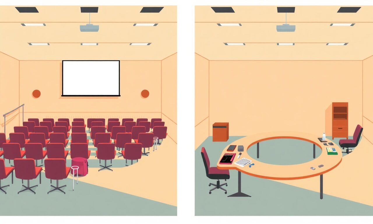
One Cart, Three Deliveries: Designing a Confirmation Page for Mixed Bundle Orders
When a buyer checks out with a download, a course, and a coaching call in a single order, your confirmation screen has to do three completely different jobs at once.
Picture the order: a fan buys your $47 lightroom preset pack, adds your $129 self-paced editing course, and tacks on a $75 one-on-one call to review their portfolio — all in one checkout. That's a great sale. It's also a design problem most creators never think about until it bites them. A single download has one job after purchase: hand over a file. A bundle with three different product types has three jobs, three timelines, and three completely different next actions, and all of it has to land on one screen the second the payment clears. Get that screen wrong and you don't just create confusion — you create support tickets, refund requests, and a buyer who never opens the thing they just paid for.
This is a narrower problem than pricing your bundle or picking the right discount. It's pure screen design: what shows up, in what order, with what buttons, the instant someone finishes paying. Get it right and a mixed order feels like a concierge handed the buyer a neatly organized welcome packet. Get it wrong and it feels like three separate purchases got dumped on the floor in a pile. If you're serious about selling bundles instead of one-off products, the confirmation page deserves as much attention as your product photos.
Why one confirmation screen isn't enough for three product types
A digital download's confirmation moment is simple: here's your file, here's your email backup, done. A course's moment is different — the buyer isn't done in ten seconds, they're just getting started, so the screen needs to orient them (where do I go, what's lesson one, how long will this take). A coaching call is different again — nothing to open or click through, just a decision to make right now: pick a time before you close this tab and forget. Three products, three different definitions of 'success' on this screen. If you treat them identically, you optimize for none of them.
The instinct a lot of creators have is to just list everything the buyer bought, like a receipt. Receipts are for accounting. Confirmation pages are for action. A buyer who scans a flat list of three line items has to figure out, on their own, what to do with each one — and figuring things out is exactly what causes cart-to-open drop-off. Your job is to remove that figuring-out step entirely.
Group by delivery mechanic, not by purchase order
The fix is to reorganize the page around how each item gets delivered, not the order it was added to cart. That gives you three natural zones, and each one needs its own header, its own explanation line, and its own single clear action:
| Delivery type | What buyer needs to see | Primary action verb |
|---|---|---|
| Instant download | File name, format, size, and a note that it's also emailed as backup | Download now |
| Course / membership access | What's included, roughly how long, where to log in | Start course |
| Coaching call / webinar seat | That nothing else happens until they pick a time — this is the one thing left to do | Book your call |
This single reordering — action-required items first, passive items after — fixes the most common failure pattern in mixed bundles: the buyer clicks the download link (because it's the easiest, most familiar action on the page), gets satisfied, closes the tab, and never books the call they paid $75 for. Three weeks later they message you asking where their session went. That's not a support problem, it's a layout problem, and it's fixable in an afternoon.
Write a different confirmation line for each product type
Generic copy like 'Thanks for your order!' at the top of the page is fine, but each product block underneath needs its own sentence that tells the buyer exactly what happens next — because 'next' is different for all three:
- Download: "Your file is ready below — we also emailed a secure link in case you need it later."
- Course: "You're enrolled. Click below to see your first lesson — most people finish module one in under 20 minutes."
- Coaching call: "One more step: pick a time that works for you. Your session link will be sent once it's booked."
That last line matters enormously. Nothing on a confirmation page frustrates a buyer more than assuming an item is handled when it actually needs them to do something. Say it plainly: this one needs one more click from you.
The email backup is doing more work than you think
On a single-download order, the confirmation email is a nice-to-have — a backup in case the buyer closes the tab too fast. On a mixed bundle, it's closer to a checklist. The buyer might open the download right away, skip the course for now, and mean to book the call later — and 'later' is exactly when the on-screen confirmation is long gone from memory. This is why store.fan sends the secure download link, course access, and meeting details automatically, both on-screen and by email, the instant payment clears — so the buyer always has a written record of all three deliverables sitting in their inbox, not just whatever they happened to notice on the page in the first ten seconds.
If you're writing the confirmation email yourself (or customizing the notification text in your dashboard), apply the exact same grouping rule: action items first, passive items after, one line per product type. Don't let the email revert to a flat receipt just because the on-screen version got the structure right.
Build the checklist before you build the page
Before you touch layout, list out every product type you currently bundle and answer one question for each: what does the buyer need to do right after paying? That answer tells you exactly what block to build.
Mixed-order confirmation page audit
0/7A confirmation page isn't a receipt. It's the last screen where you still have the buyer's full attention — use it.— store.fan product team
Why this is worth fixing before you launch more bundles
Bundling different delivery types is one of the highest-leverage moves in a creator's pricing toolkit — it raises average order value without you creating a single new asset. But the leverage only shows up if every piece of the bundle actually gets used. A course nobody starts and a call nobody books don't just cost you support headaches, they quietly kill your bundle's reputation: buyers who forget half of what they paid for don't buy your next bundle, and they don't leave you a great testimonial either. The confirmation screen is the cheapest, fastest fix available, because it costs you zero new content and zero new pricing decisions — just better organization of what you already built.
If you're still selling everything as one-off links with no organized checkout flow behind them, this is also a good moment to zoom out. A proper storefront — one link, real product pages, and delivery logic that's already built for downloads, courses, and calls side by side — solves most of this for you before you write a line of copy. Check out a live example store to see how a real creator organizes a mixed catalog, then browse the blog for more guides on bundling and checkout design.
Yes — when a buyer checks out with multiple product types in one order, store.fan delivers each one through its native mechanism (secure download link, course access, or booking flow) automatically on the confirmation screen and by email, so you don't have to hand-build separate logic per bundle.
That's fine and common — the confirmation email keeps every deliverable available indefinitely, so the buyer can come back to the download or course access whenever they're ready. Nothing expires just because they didn't click it first.
It's one of the strongest bundle combinations that exists — the course delivers the knowledge, the call delivers accountability and personalization. The friction is real but manageable with clear confirmation-page sequencing, not a reason to avoid the bundle.
You can start building bundles on the free plan. If you're selling regularly, it's worth comparing plans — paid plans carry 0% platform fees, which matters more as your bundle order values climb.
Check the FAQ for delivery specifics, or contact support if you want a second pair of eyes on your specific bundle setup before you launch it.
Ready to sell mixed bundles without cobbling together three separate delivery systems?
Start freeThe math on mixed bundles is simple: more products per order without more content produced, as long as every piece actually gets delivered and used. That outcome doesn't come from clever pricing or a bigger discount — it comes from a confirmation screen that respects the fact that a download, a course, and a call are three different promises, and each one deserves its own moment on the page. Build that once and every future bundle you launch inherits it for free. If your current setup is still a patchwork of separate tools stitched together, it might be time to create your store and let one platform handle the download, the course, and the calendar in a single, well-organized checkout.
Turn your knowledge into income
Launch your Store.Fan in minutes — sell digital products, courses, and calls straight from your bio. Free to start.